The pictures below are of the Belk at River Ridge Mall in Lynchburg, Va. This was originally the flagship store for the former Leggett chain. It opened in 1981 with as glamourous and elegant a design as any store had at the time.
Over the course of nearly a quarter century, styles changed and Lynchburg's economy tanked. Belk took over the store from Leggett, changed the lighting, and removed a plethora of tinted mirrors, but the store itself was mostly unchanged.
Fast forward to now. The store is past due for a renovation, but the department store industry is in a slump and the remodel budget is as low as possible. The solution: use the existing walls and ceilings as much as possible and do a tasteful, if a bit boring, renovation.
What kills me about this, as a admitted retail design snob, is that the remodel's not an improvement over the old design and it's not at all creative. It looks like Kohl's, which is not nearly as classy a store as this store is. This blandness is a circular trap. The blander the store gets, the less people spend, which means the remodels have to get cheaper and cheaper each time until there's no money left and the store dies.
I guess it could be a lot worse, but still, the reults are underwhelming:
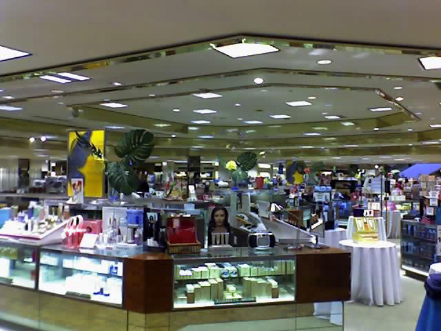 BEFORE 1: This is the former Cosmetics & Fragrances department. It's actually held up pretty well considering how long it's been around.
 BEFORE 2: This is the former Men's Suits department, tasteful to a fault, but severely dated.
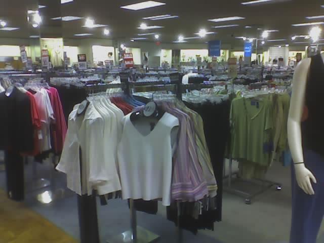 BEFORE 3: Ladies Sportswear. Certainly not awe-inspiring, but better than a lot of stores of its vintage.
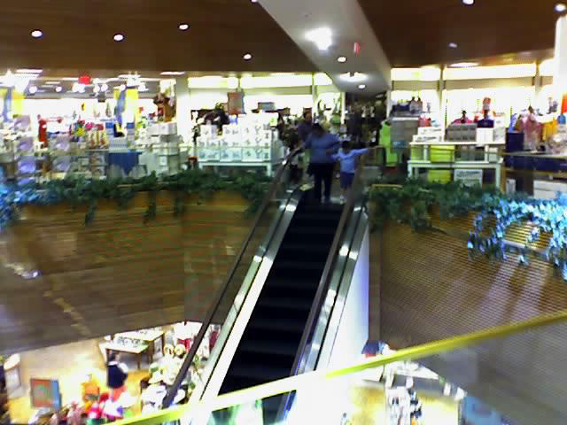 BEFORE 4: The escalator well. I'm not sure what they're going to do here, but I can feel a beige-colored disaster coming on.
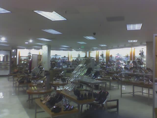 AFTER 1: The new Family Shoes department, just around the bend from where the 'Before 2' picture was taken. Not bad, but very blah. Note that the original ceiling grid and tiles were reused. Also note that this wall, ceiling and floor design now covers every ench of selling space in the store, or will when they get done.
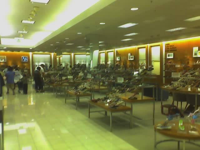 AFTER 2: Pop Quiz: is the same store as the photos above and below? The answer is no. But it's pretty damn close, don't you think? This is a newly remodeled Belk shoe department in Raleigh, N.C. Same tile, same wood, same paint, same ceiling, same shoes. Someone in Belk store design is on auto-pilot.
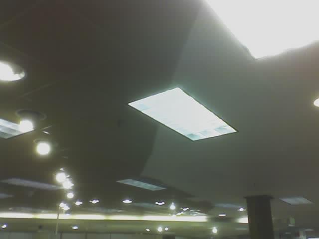 AFTER 3: Back to Lynchburg. Need more proof they're playing it cheap? Here's a spot that's being currently renovated in the store. Note the repainted ceiling.
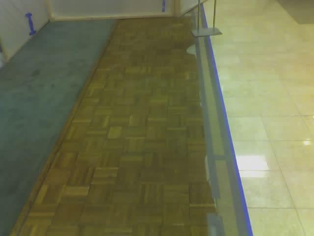 AFTER 4: I will give 'em one thing. I hate that the floors are so beige, but they do look a lot better than the old parquet and worn green carpeting
I agree that this store remodel reflects the "race to the bottom" that seems to have taken hold in the retail business...it's all about looking like Kohl's, not about looking like the grand emporia of yesteryear. Like you, I lament that department stores are refusing to embrace the things that once made them special and different.
ReplyDeleteI love the "before" photos...reminds me of what department stores looked like in my youth.
I remember standing at that very fragrance counter in 1981 or '82 watching my mom buying Polo cologne for me and my brother. Back then all those recessed lights had smoked glass covers and the columns were covered in tinted mirrors. It was the coolest store!
ReplyDeleteI can't pick up any enthusiasm for what they've done. It's just so bland. One of these days they might see what kind of mess they made there, but probably not.
The industry is going to hell in a handbasket and they're responding with this?