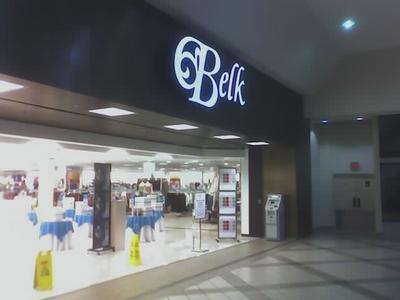
 Here's the mall entrance; stripped, but still somewhat proud.
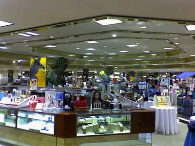
 The "before" shot of the fragrance deparment was dated but nice.
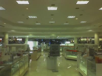
 The "after" shot is so bland. All the glamour is replaced by gallons of beige paint. even though every surface is lighter in color than it was, it's inexplicably darker.
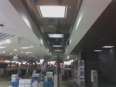
 I can't resist a shiny surface when I have a camera.
 This is what the surface looks like at eye level.
Related:
we remodeled. ho-hum
check out what 1981 looked like in retail design
I agree that this remodel isn't that impressive. In order to stay competitive, department stores have to get ritzier and more exciting...not more downscale and bland. Let Kohl's be Kohl's.
ReplyDeleteWhen I consider that Belk is the same company that employed supermarket-like shopping carts (as you shared in an earlier post), I doubt that the company is headed in the right direction.
The top 10% of Belk's store base is as competitve with the national luxury chains as can be expected in their markets, the rest are evolving into a bland facimile of the department store experience. I feel for Belk. They've lost a lot of their class.
ReplyDelete